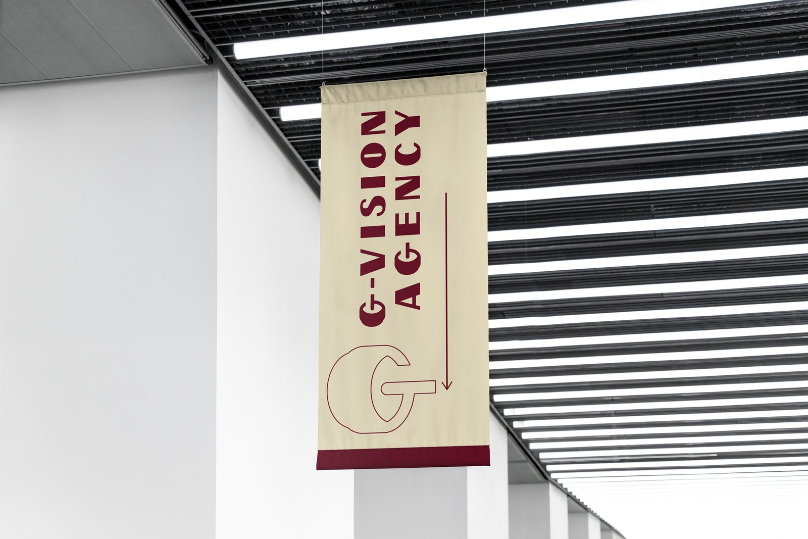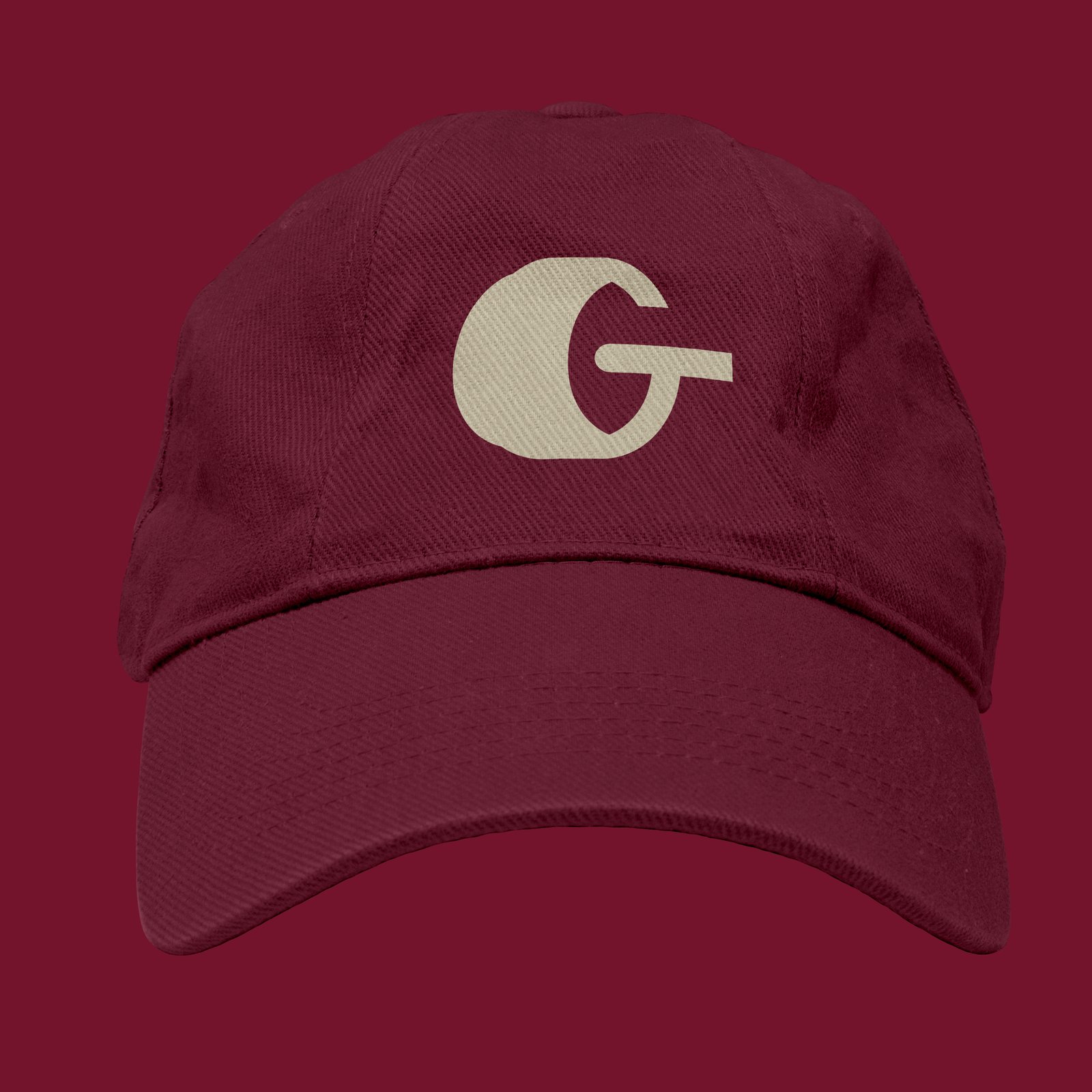
Concept
This concept is built around a single, powerful idea: vision as both a human instinct and a crafted discipline.The logo features a forward-facing camera lens drawn at a subtle perspective angle, giving it depth, direction, and a sense of intention. It feels active rather than static, as if it’s in the act of observing, framing, and capturing.What makes this concept truly distinctive is how the negative space naturally forms a vertical human eye within the lens. The slightly pointed edges, created by the perspective, transform the inner glass element into something more organic and symbolic. This was not forced, but discovered — which makes it even more meaningful. It reflects the idea that true vision is not always created, but recognized.At the center, a small circle acts as both the camera’s focal point and the pupil of the eye, reinforcing clarity, precision, and awareness. From this point, a subtle ray of light emerges, symbolizing vision extending outward — the act of seeing, interpreting, and projecting meaning. Together, these elements form a hidden letter “G”, seamlessly embedded within the composition. This integration is intentional yet unobvious, inviting a second look and rewarding attention to detail.
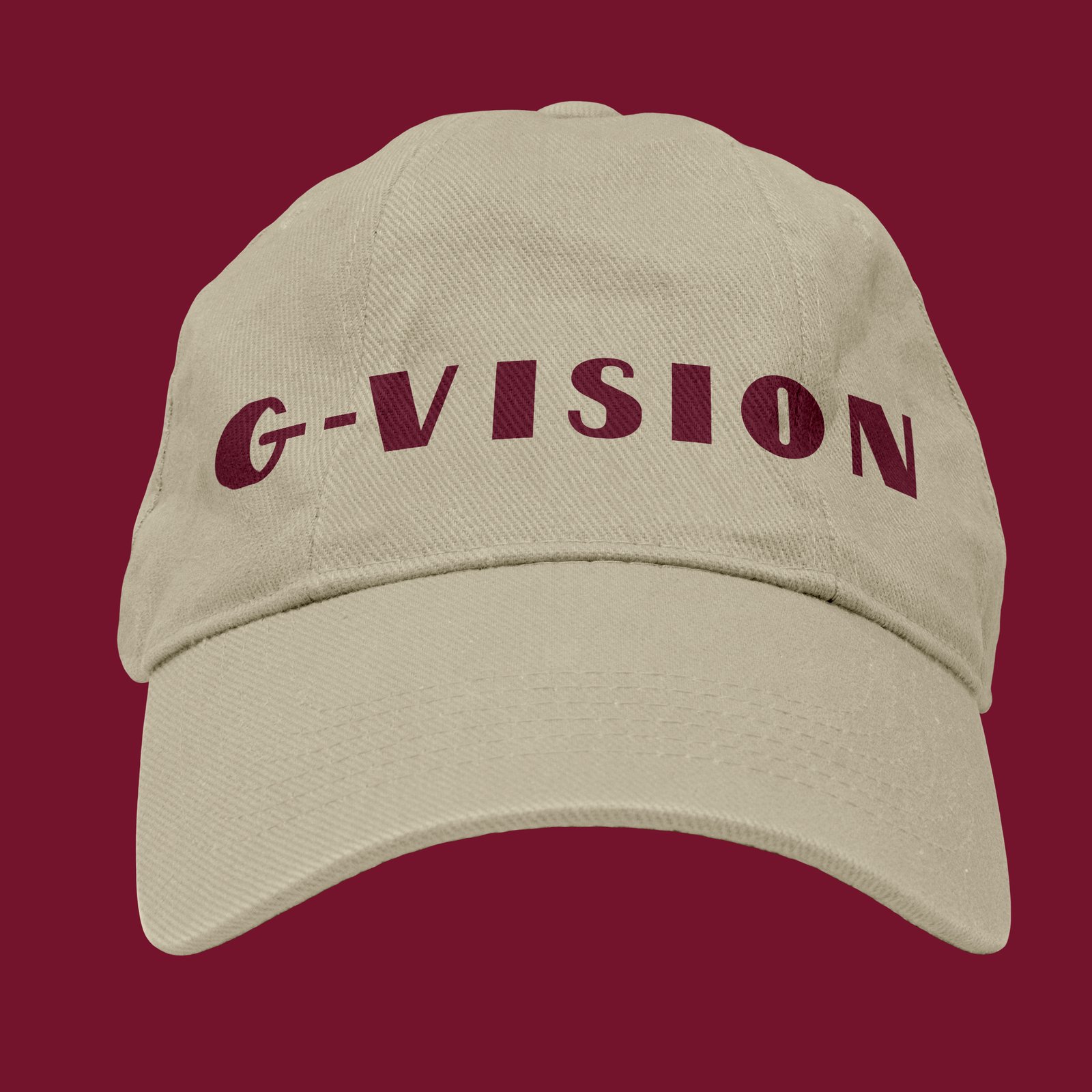
An important extension of this concept comes from the physical structure of the lens itself. The contrast between the thicker, more solid back portion of the lens and the thinner, more refined front glass naturally informed the design of the wordmark. This relationship led to the creation of a custom high-contrast, calligraphic sans-serif logotype, where each letter follows a refined rhythm of thick downward strokes and thin upward strokes.This approach is rooted in traditional calligraphic principles, where downward strokes carry weight and upward strokes remain light, but translated into a clean sans-serif form. The result is a logotype that feels both modern and elegant, combining clarity with expressive detail. It also creates a strong visual harmony between the symbol and the typography, as both share the same language of contrast, balance, and precision.
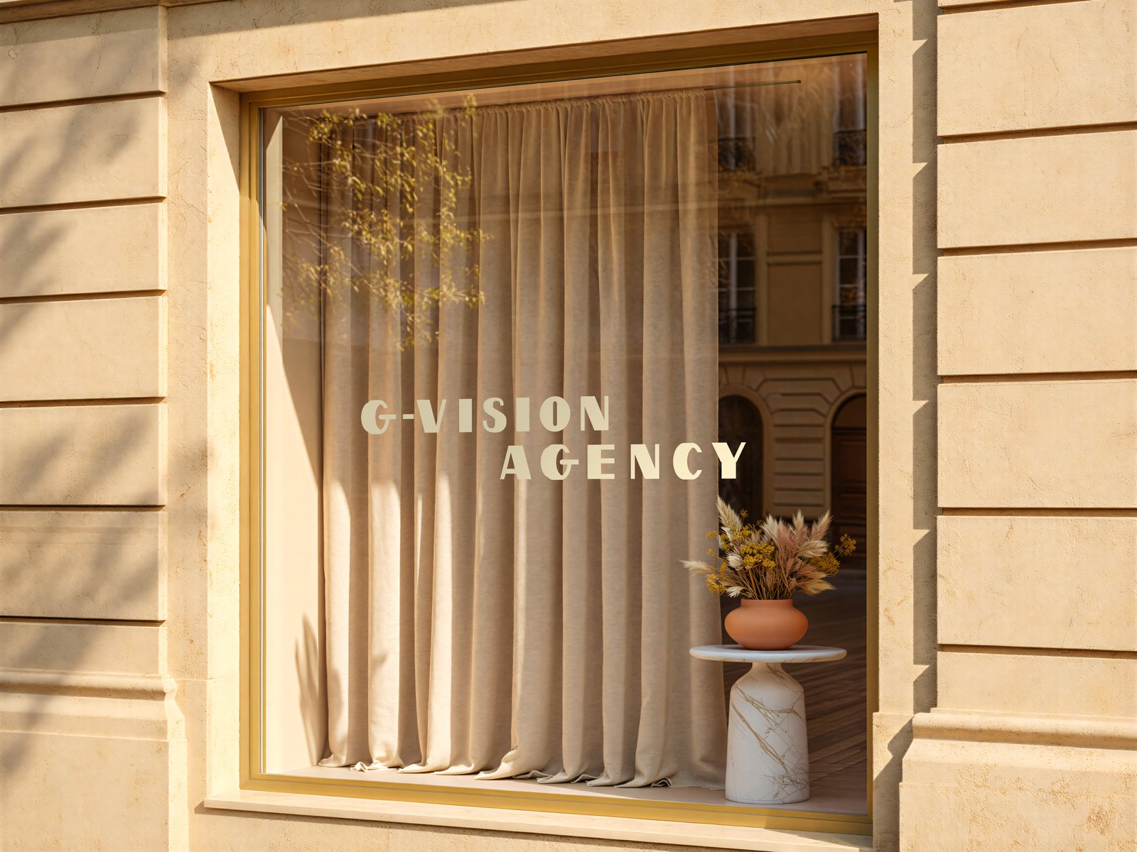
The wordmark is further refined through wider letter spacing and generous negative space, creating a sense of openness and breathing room. This is a deliberate choice. In luxury communication, space is not empty — it signals confidence, clarity, and control. By allowing the identity to breathe, the brand feels less crowded, more intentional, and more elevated. This approach is designed to resonate with premium clients like Raffaele, who are naturally drawn to brands that communicate quality through restraint rather than excess.
Symbolically, the concept operates on multiple layers:
• The lens represents technical mastery and execution
• The eye represents intuition, taste, and perception
• The light represents vision, direction, and creative output
• The hidden “G” represents identity embedded within craft
• The calligraphic contrast in the logotype represents refinement, control, and intentional design
• The use of space represents confidence, clarity, and premium positioning
Together, these elements reflect the true nature of G-Vision Agency — a balance between human sensitivity and technical precision, between artistic expression and structured execution.Visually, the mark feels cinematic, focused, and elevated. Conceptually, it communicates a brand that doesn’t just create visuals, but understands how to see, interpret, and present them at the highest level.Overall, this logo captures G-Vision as a brand defined by perception — not just what is seen, but how it is seen.