Concept
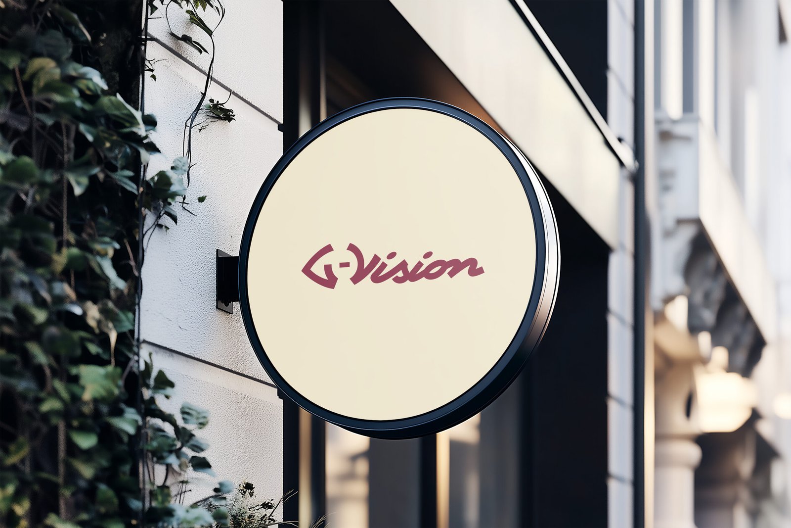
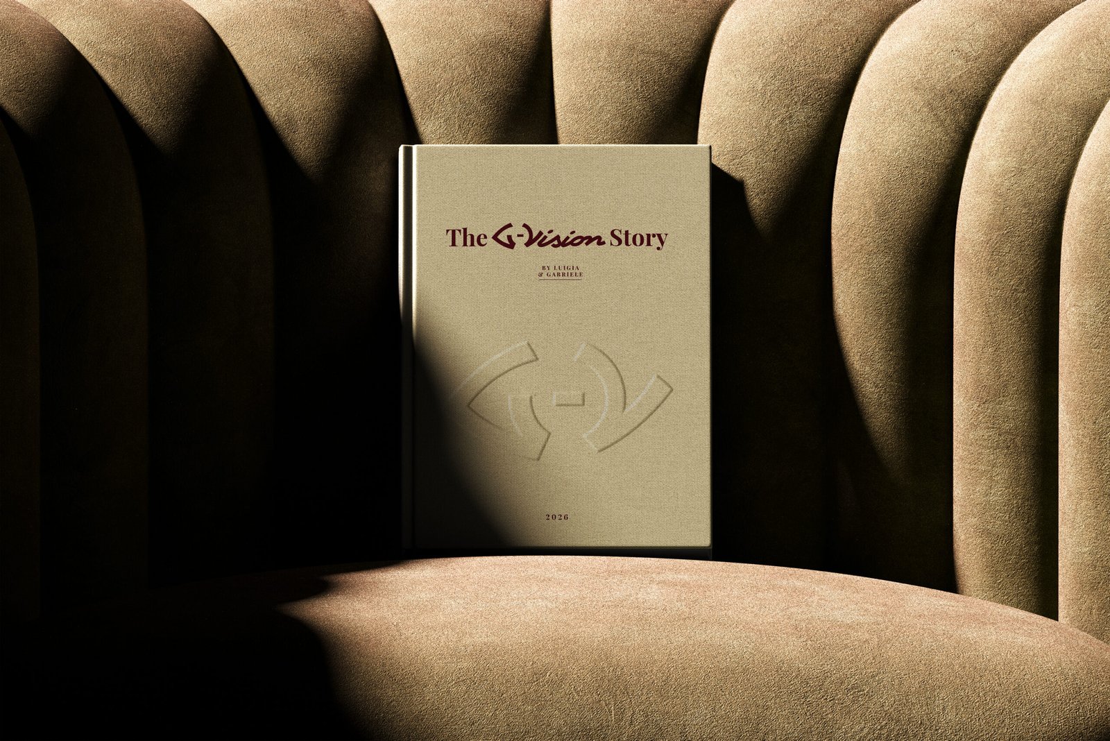
This logo concept is built around the idea of vision, perception, and artistic identity, which sits at the core of G-Vision Agency.At the center of the mark is a custom GV monogram, designed to subtly resemble both an eye and a camera lens. This dual symbolism is intentional. The eye represents perspective, awareness, and the human ability to see beauty and detail. The lens represents precision, craft, and the technical side of capturing and shaping that vision. Together, they communicate what G-Vision truly does — not just capturing visuals, but refining how things are seen.
The circular form within the monogram reinforces this idea of focus and clarity, almost like looking through a frame. It creates a sense of depth and draws attention inward, symbolizing the agency’s role in bringing out the true essence of a brand.
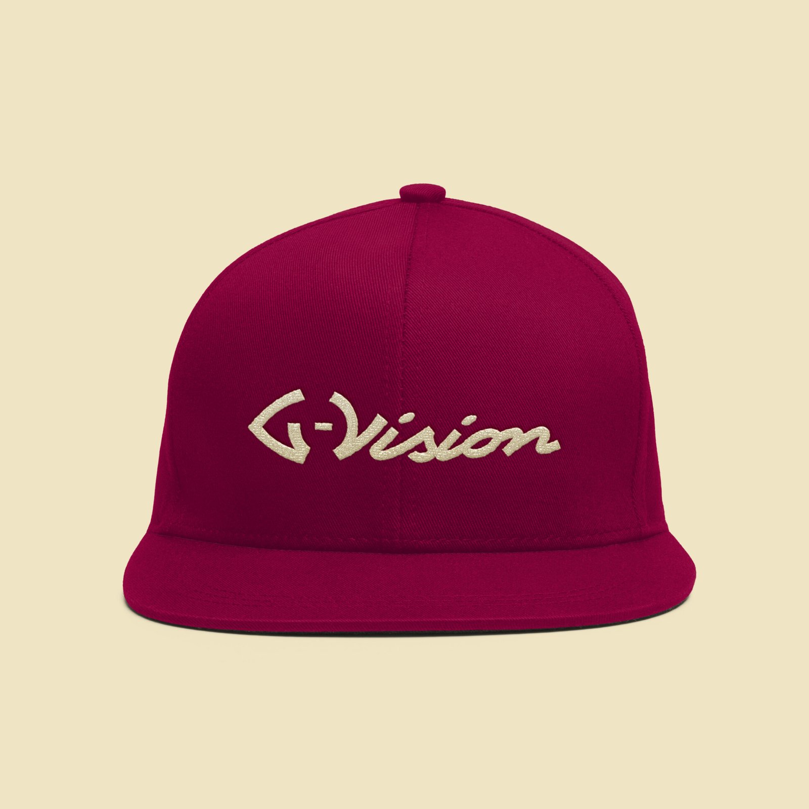
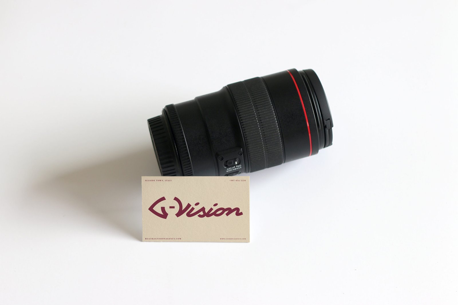
Contrasting this structured symbol, the logotype is expressed in a handwritten cursive style. This introduces a human, expressive layer to the identity. While the monogram reflects control and precision, the cursive lettering reflects creativity, intuition, and artistic freedom. It feels personal, crafted, and intentional — not mass-produced. This balance between the two elements is key. The monogram anchors the brand in clarity, direction, and professionalism, while the handwritten type adds emotion, character, and individuality.
Together, they visually represent the dual nature of G-Vision: structured yet creative, refined yet expressive.On a deeper level, the logo communicates the idea that every brand already has a story — it simply needs the right eye and the right lens to reveal it properly. That is the role G-Vision plays.Overall, the identity feels distinctive, memorable, and aligned with a modern creative studio that values both artistic expression and intentional execution.